Best Color Schemes For Home Interiors 2026

“Should we go with beige again, or try something bold this time?”
“Wait… what if we completely change the vibe of the house?”
If this sounds like a familiar conversation, you are not alone. Choosing the right color schemes for home interiors can feel overwhelming, especially when trends evolve every year, and personal style plays such a big role in decision-making.
In 2026, colors are no longer just about aesthetics; they reflect personality, mood, lifestyle, and even wellness, which is why many homeowners now prefer guidance from the best interior designers in Bangalore to create thoughtfully curated spaces.
But here’s the real question: how do you choose a color palette that not only looks stunning today but continues to feel relevant and comforting for years to come?
Key Points at a Glance
- 2026 trends focus on warm, earthy, and calming tones that create emotional comfort
- Smart layering of colors enhances depth, dimension, and visual appeal
- A color combination chart for home interior simplifies decision-making and reduces confusion
- Mixing textures with tones creates a more luxurious and balanced finish
- Professional guidance from home interior designers in Bangalore ensures cohesive and future-proof results
- Every room should have a purpose-driven color palette aligned with its function
Why Color Schemes Matter More Than Ever in 2026
Colors today go beyond decoration; they directly influence how you feel, think, and behave within a space. Research suggests that over 85% of homeowners believe color impacts their mood, which explains why thoughtful color planning is becoming a priority rather than an afterthought.
A well-designed home decoration color combination can completely transform your space. It can make a compact apartment feel open and airy, turn a bright room into a cosy retreat, or elevate a simple home into a luxurious sanctuary without major structural changes.
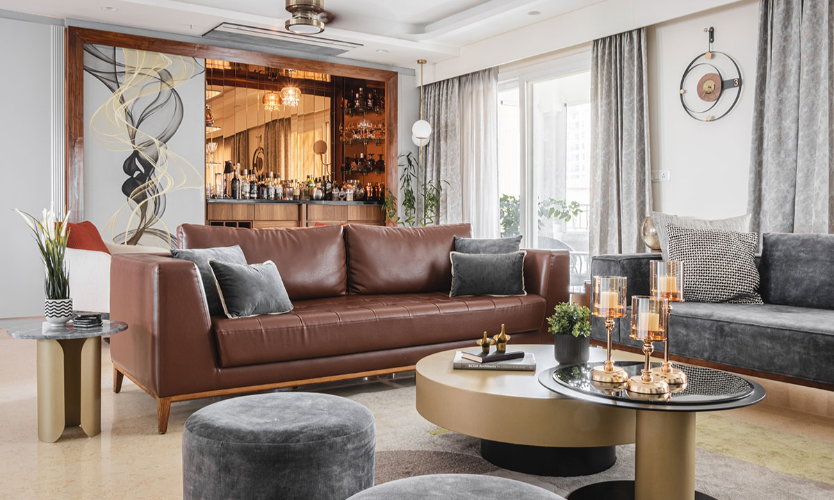
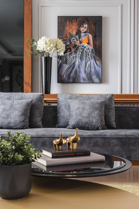
1. Warm Earth Tone Palettes: The Star of 2026
One of the most dominant trends this year is the rise of warm earth tone palettes, inspired by nature and organic living. These colors bring a sense of grounding and calmness, making them ideal for modern lifestyles that often feel fast-paced and overwhelming.
Shades like terracotta, clay, olive green, caramel, and sand beige are gaining popularity because they create a timeless aesthetic while still feeling fresh and contemporary. They also pair beautifully with natural materials like wood, stone, and linen, enhancing the overall sensory experience of a space.
Best combinations:
- Terracotta + cream + olive green for a cosy, earthy vibe
- Sand beige + walnut brown + soft white for understated elegance
- Rust orange + muted gold accents for a rich, warm atmosphere
These palettes work exceptionally well in living rooms and bedrooms, where comfort and relaxation are essential.
2. Soft Neutrals with a Modern Twist
Neutrals are no longer plain or predictable; they are evolving into more layered and dynamic tones. In 2026, homeowners are moving beyond basic whites and greys and embracing neutrals with subtle undertones that add depth and character.
Colors like warm greige (a blend of grey and beige), ivory with peach undertones, and taupe with hints of pink are becoming increasingly popular. These shades create a soft, inviting backdrop while still allowing flexibility to experiment with décor and accents.
They are particularly effective in:
- Minimalist interiors that focus on simplicity and clarity
- Scandinavian-style homes that emphasise warmth and functionality
- Compact apartments where lighter tones enhance spaciousness
Tip: Pair these neutrals with textured fabrics like linen curtains, woven rugs, or boucle furniture to avoid a flat or monotonous look.
3. Nature-Inspired Greens and Blues
Biophilic design continues to influence interior trends, making greens and blues essential choices for modern homes. These colors connect indoor spaces with nature, promoting relaxation, mental clarity, and emotional balance.
Trending shades such as forest green, sage green, deep ocean blue, and dusty teal are being widely used across homes. They not only look visually appealing but also create a calming atmosphere, making them perfect for spaces where you unwind or focus.
Additionally, these colors pair beautifully with wooden finishes, indoor plants, and natural lighting, creating a seamless blend between interior and exterior environments.
4. Bold Accent Colors for Statement Spaces
While base colors remain subtle and calming, accent colors are becoming bolder and more expressive in 2026. Homeowners are using vibrant tones strategically to add personality and visual interest without overwhelming the space.
Popular accent colors include burnt orange, mustard yellow, deep burgundy, and charcoal black. These shades are ideal for creating focal points and highlighting specific areas within a room.
Use them for:
- Feature walls that draw immediate attention
- Statement furniture pieces like sofas or chairs
- Decorative elements such as cushions, rugs, or artwork
A simple rule to follow is the 80-20 principle, where 80% of the room consists of neutral tones and 20% is dedicated to bold accents.
5. Color Combination Chart for Home Interior
To make decision-making easier, here’s a quick guide you can follow:
| Room Type | Primary Color | Secondary Color | Accent Color |
|---|---|---|---|
| Living Room | Beige / Greige | Olive Green | Rust Orange |
| Bedroom | Soft Blue | White | Gold / Brass |
| Kitchen | Ivory | Sage Green | Matte Black |
| Bathroom | Light Grey | Aqua Blue | Silver |
| Home Office | Taupe | Forest Green | Mustard Yellow |
This color combination chart for home interior provides a clear framework, helping you visualise how different colors work together while maintaining harmony and balance.
6. Room-by-Room Color Strategy
Living Room
The living room is often the first impression of your home, so it should feel welcoming and stylish. Warm tones like beige, terracotta, or soft browns create an inviting environment, while layered lighting and contrasting furniture add depth.
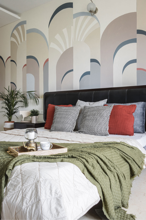
Bedroom
Bedrooms should promote relaxation and restfulness, making calming shades like soft blue, muted green, or pastel neutrals ideal choices. These colors help reduce stress and improve sleep quality over time.
Kitchen
Kitchens benefit from clean, fresh palettes that enhance brightness and hygiene. Shades like white, sage green, or light grey paired with matte finishes create a modern yet functional look.
Bathroom
Light colors combined with reflective surfaces make bathrooms feel larger and more luxurious. Adding subtle metallic accents enhances the spa-like experience.
Home Office
Productivity-focused home office spaces should use colors like green or muted yellow, which are known to boost concentration and creativity without causing visual fatigue.
7. How to Choose the Right Color Scheme
Choosing the perfect palette doesn’t have to be complicated if you follow a structured approach. Start by identifying the mood you want to create, whether it’s calm, energetic, cozy, or luxurious.
Next, consider lighting conditions, as natural and artificial light can significantly alter how colors appear throughout the day. Always begin with a neutral base, then layer complementary shades and accents gradually.
Finally, test your choices using sample patches on walls before committing. This ensures your home decoration color combination looks exactly as expected in your actual space.
8. Common Color Mistakes to Avoid
Even with the best intentions, certain mistakes can affect the outcome of your interiors. One of the most common errors is using too many bold colors, which can make a space feel chaotic rather than stylish.
Ignoring lighting conditions is another critical mistake, as colors can look drastically different under various lighting setups. Additionally, choosing trends without considering long-term appeal may lead to frequent redesigns.
This is why consulting experts like interior designers in Indiranagar can help you make informed decisions and avoid costly errors.
9. Why Professional Help Makes a Difference
Designing a home involves more than selecting colors; it requires a holistic approach that considers layout, lighting, materials, and functionality. Professional designers bring expertise that ensures every element works together seamlessly.
By working with home interior designers in Bangalore, you gain access to curated palettes, innovative ideas, and a cohesive vision that aligns with your lifestyle. This not only enhances aesthetics but also increases the overall value and usability of your home.
Final Thoughts
Choosing the right color schemes for home interiors in 2026 is about creating a balance between trends, functionality, and personal expression. Whether you prefer soothing neutrals, warm earth tone palettes, or bold accent highlights, the key lies in thoughtful planning and execution.
For a seamless and professional transformation, collaborating with the best interior designers in Bangalore can help you bring your vision to life while avoiding common pitfalls. Platforms like Zinoti further simplify the process by helping design professionals streamline their services and deliver exceptional client experiences.
Your home deserves more than just color; it deserves a story.
FAQs
1. What is the best color scheme for small homes?
Light and neutral shades like beige, white, and soft grey are ideal for small homes because they reflect more light and create a sense of openness. When paired with minimal furniture and subtle accents, these colors make rooms appear larger, brighter, and less cluttered, enhancing both visual space and overall comfort.
2. Are bold colors still trending in 2026?
Yes, bold colors continue to trend in 2026, but they are used more thoughtfully. Instead of dominating entire rooms, they are incorporated as accents through feature walls, furniture, or décor elements. This approach allows homeowners to add personality and vibrancy while maintaining a balanced, modern, and visually appealing interior space.
3. How do I choose colors for different rooms?
Choosing colors for different rooms depends on their function and the mood you want to create. Bedrooms benefit from calming tones like soft blues or greens, while workspaces need energising shades like muted yellow or green. Living rooms should feel inviting, so warm neutrals or earthy tones work best for a welcoming atmosphere.
4. Can I mix warm and cool tones?
Yes, mixing warm and cool tones can create a sophisticated and layered look when done correctly. The key is to maintain balance by selecting one dominant tone and using the other as a complement. This contrast adds depth and visual interest while ensuring the overall space still feels cohesive and harmonious.